
The Psychology of Color in Art and How to Use It in Your Home
Color is one of the most powerful tools in art. It influences mood, evokes emotions, and can completely transform the energy of a space. Whether you’re selecting a piece of art to match your home’s aesthetic or want to create a specific feeling in a room, understanding the psychology of color is key. Let’s explore how different colors affect us and how to use them effectively in your home.
Understanding the Psychology of Colors
Each color has its own emotional and psychological associations. Here’s a quick guide:
Red: Bold and energizing, red stimulates passion and excitement. It’s perfect for spaces where you want to inspire energy, like dining rooms or creative studios.
Blue: Calming and serene, blue promotes relaxation and focus. It works well in bedrooms, bathrooms, or home offices.
Yellow: Bright and cheerful, yellow evokes happiness and optimism. Use it to add warmth to kitchens or living areas.
Green: Refreshing and natural, green symbolizes balance and renewal. It’s ideal for any space where you want to feel grounded, like living rooms or reading nooks.
Purple: Luxurious and creative, purple is associated with imagination and sophistication. Add it to spaces where you want to feel inspired, like home libraries or art studios.
Orange: Invigorating and playful, orange combines the energy of red and the cheerfulness of yellow. It’s great for workout spaces or informal gathering areas.
Pink: Soft and nurturing, pink conveys compassion and warmth. It’s a lovely choice for bedrooms or intimate spaces.
Neutral Tones (Black, White, Gray, Beige): These provide balance and sophistication. They’re versatile and serve as excellent backdrops for bold art.
Choosing Artwork Based on Color and Mood
When selecting art, think about the mood you want to create in each room:
1. Create a Calming Retreat
For spaces like bedrooms or meditation areas, choose artwork featuring soft blues, greens, or muted pastels. These colors promote relaxation and tranquility.

BELIEVE
This painting evokes a sense of calm through its serene composition and soothing color palette. The gentle brushstrokes and soft hues create an atmosphere of tranquility, allowing viewers to connect with the essence of nature. The bobcat, portrayed in a relaxed posture, embodies a quiet strength that invites reflection and peace. Each detail, from the delicate fur to the peaceful surroundings, fosters a feeling of harmony, making this piece an ideal addition to any space seeking a moment of stillness and contemplation..
2. Energize Your Space
Add vibrancy to a room with artwork that incorporates bold reds, oranges, or yellows. These colors are great for living rooms, gyms, or play areas.

THE COLOR OF HAPPINESS
Bright flowers in a painting can serve as a vibrant focal point in any room, infusing your space with energy and positivity. The bold colors and lively forms evoke a sense of vitality and invigorate the atmosphere, enhancing both mood and creativity. Whether displayed in a living room, office, or entryway, this artwork captures the essence of nature's beauty, promoting a refreshing environment that inspires joy and productivity. Embrace the uplifting spirit of bright flowers and transform your space into a dynamic haven of inspiration and warmth.
3. Add Sophistication
Deep purples, blacks, or metallic tones create a sense of elegance. Look for abstract or modern pieces for dining rooms or home offices.

THE DOGWOOD
The interplay of a metallic background with expressive brush strokes elevates the overall aesthetic, bringing a layer of sophistication to the piece. The shimmering surfaces capture light in dynamic ways, while the carefully applied strokes create depth and movement. Complementing this richness, the delicate white dogwood flowers offer a striking contrast, symbolizing purity and renewal. Together, these elements harmonize to transform the artwork into a refined statement piece, making it an ideal addition to any sophisticated space.
4. Brighten Your Home
To make a room feel more welcoming and uplifting, incorporate artwork with bright yellows, pinks, or whites. Perfect for entryways or kitchens.
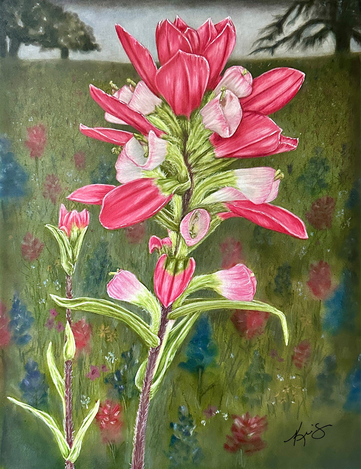
THE OTHER TEXAS BLOOM
Enhance your home’s ambiance with the vibrant hues of an Indian paintbrush painting. This striking artwork captures the beauty of nature, infusing your space with warmth and vitality. The lively pinks and greens of the Indian paintbrush flowers evoke feelings of joy and serenity, making any room feel more inviting. Whether displayed in a living room, entryway, or bedroom, this painting serves as a focal point that uplifts the spirit and inspires conversation. Bring the charm of the outdoors inside, transforming your home into a haven of comfort and positivity.
5. Balance Busy Spaces
If a room has a lot of activity, like a family room, use neutral-toned art to create harmony and balance. Soft grays, beiges, or monochromatic themes work well.

STRENGTH & HONOR
Transform your space with this painting, designed to bring tranquility to busy environments. The gentle neutral tones harmonize effortlessly with various décor styles, fostering a sense of balance and calm. This artwork serves as a focal point that captures attention without overwhelming the senses, making it perfect for living rooms, offices, or any area needing a touch of serenity. Embrace the elegance of simplicity and allow this majestic creature to anchor your space in peaceful sophistication.
Using Color to Tie Your Decor Together
Artwork can unify your home’s color scheme:
Match Your Palette: Choose pieces that feature your room’s dominant or accent colors to create a cohesive look.
Create Contrast: Use complementary colors to make your artwork stand out. For example, a vibrant blue painting can pop against an orange-toned wall.
Layer Tones: Incorporate art with varying shades of the same color to add depth and texture to your decor.
Experiment with Seasonal Colors
You don’t have to commit to one palette year-round. Consider rotating artwork to match the seasons:
Spring: Light pastels and floral motifs.
Summer: Bright, tropical colors like turquoise and coral.
Fall: Warm earth tones, such as amber and rust.
Winter: Cool blues and silvers for a crisp, serene vibe.
Final Thoughts
Choosing artwork for your home is a personal and creative process. There is no hard fast rule you have to follow, but by understanding the psychology of color, you can select pieces that not only look beautiful but also enhance the mood and energy of your space. Whether you’re drawn to soothing landscapes or bold abstract designs, let color guide your choices to create a home that feels uniquely yours.
Ready to find the perfect piece? Explore my collection or contact me for a custom commission that’s tailored to your style and space.